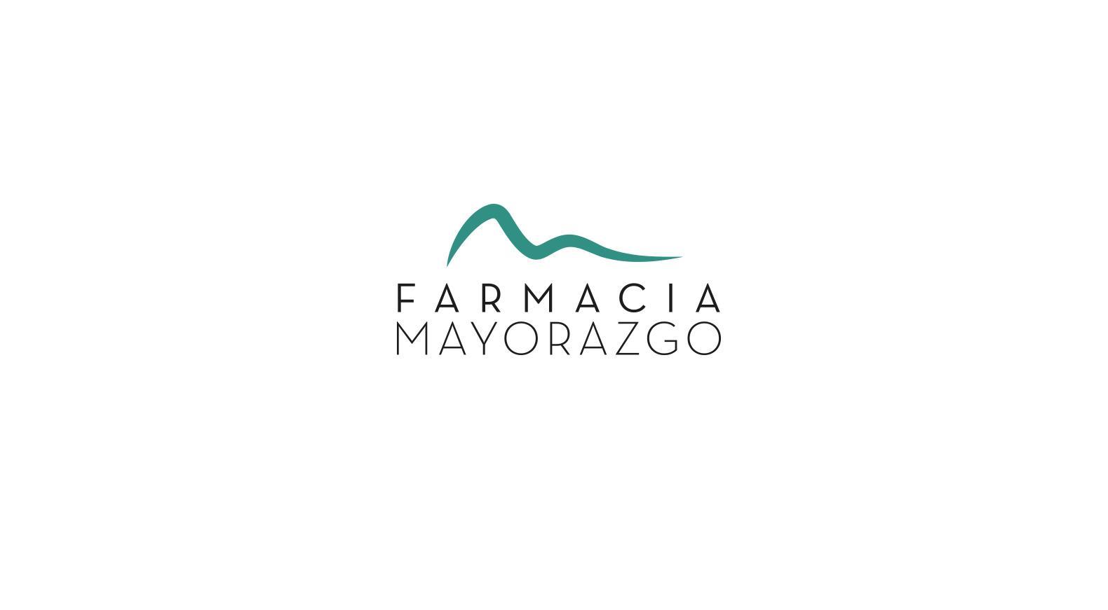
We wanted this pharmacy's image to stand out from the rest, so we resorted to a very stylized design with soft lines.
Given the importance of its name which refers to the avenue where it is located, we decided to play with the M of the initial, giving it a shape that was pleasant and soothing, in contrast to the elegance and seriousness of the chosen typography.
We also worked on the shape of the logo thinking that this pharmacy has a wide catalog of beauty products, being one of its main products.
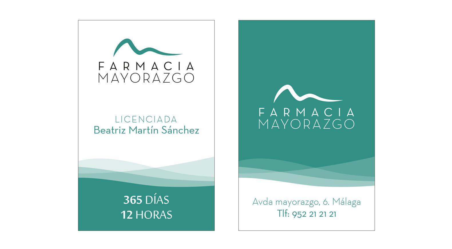
As for the identity, we worked in the same vein (soft and pleasant shapes) and with the inspiration that the proximity of the sea transmits to us.